
“We wanted to modernise the L Marks brand while making it clearer and more consistent in how we communicate what we do. Yes We Can have done a great job of bringing a fresh, contemporary look to the business, with a sharper colour palette and a clear set of guidelines that work across our different programmes. I'm really pleased with how it's all come together. Our refreshed brand feels more current, professional and better reflects who we are today.”
Daniel Saunders, CEO of L Marks
L Marks, the UK’s largest corporate innovation specialist, tasked us with rebuilding a brand identity untouched since the company was founded, a few months after appointing us as their global marketing and communications partner.
The firm works with the world’s leading organisations, such as DPD, GXO and EFL, to identify, validate and deploy the solutions that solve their operational challenges and future-proof the business, whether that means sourcing external technology, building new ventures from within, or establishing the strategic foundations that make innovation repeatable.
For more than a decade it has run over 130 programmes inside regulated and operationally complex businesses, with 78% of solutions that enter reaching deployment and over 500 companies in the alumni network.
The Problem We Were Solving
L Marks stands between two audiences who judge a brand by opposite standards.
On one side are CEOs, COOs and chief strategy and innovation officers at Fortune 500 companies. They are experienced buyers of professional services, they have been sold to many times by firms making similar claims, and they discount promotional language instinctively. They read reports, legal documents and board papers, and need to see a firm that can be trusted inside a regulated business.
On the other are founders and senior leaders at startups and scaleups, who are commercially sophisticated and direct. They need to see a firm that is current, credible and worth their time.
Both pointed the same way: an identity that carries the proof instead of describing it.
The brand was written and designed by a lot of hands. Programme managers, partnerships leads and the senior team all published under one name, across press releases, LinkedIn, microsites, newsletters, case studies and event materials, for the UK and US at once, with no defined standard to work from.
Brand Position
Corporate innovation has a credibility problem. Many providers run programmes, but the innovation rarely gets implemented inside the business.
This is precisely what distinguishes L Marks from other providers. With 78% of the solutions entering its programmes reaching deployment, the evidence had to become the position.
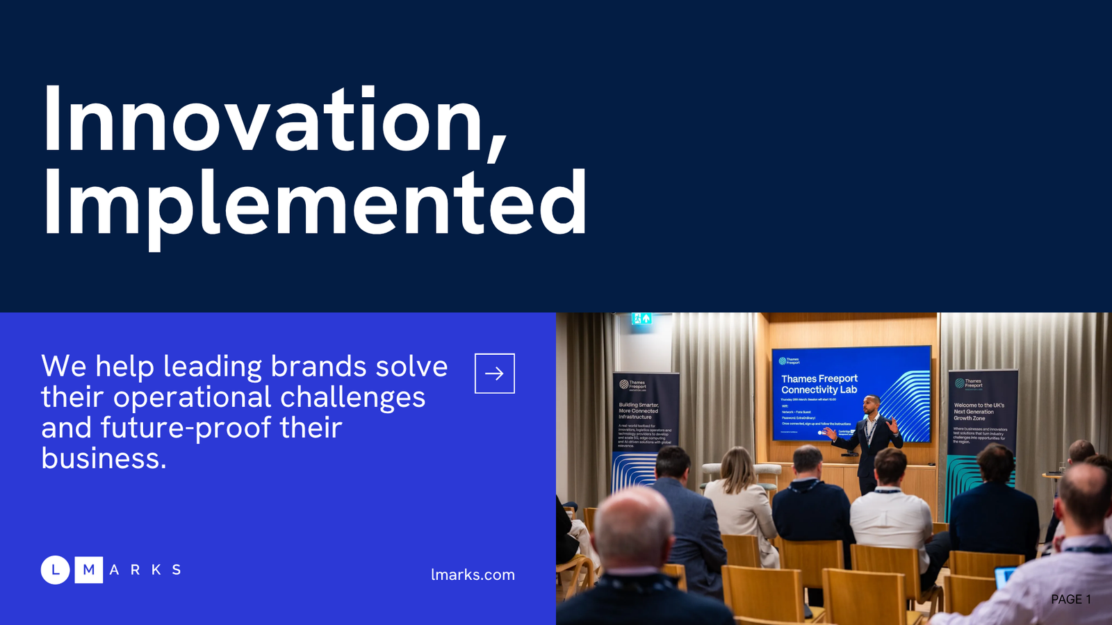
Innovation, implemented.
Tone of Voice
Following the audience analysis, our decision was to strip promotional language out and carry every claim with a number, a named company or a concrete fact.
So the voice states that 78% of solutions entering the programmes reach deployment. It does not call that an industry-leading deployment rate demonstrating a commitment to delivering results. The first does more commercial work because it respects the reader’s intelligence.
We built the tone on seven characteristics: declarative over persuasive, benefit-led, story-led, evidence over self-description, energetic rather than excited, plain English at information density, and consistent across every format.
Underneath them we wrote the rules that execute the register: sentence length and shape, how each sentence connects to the one before it, grammatical person by audience, vocabulary, punctuation, spelling by market, and a locked table for the firm-level figures.
Passion is one of L Marks’ values and we kept it out of the copy entirely. A firm that stays in touch with over 500 companies long after their programmes end has already demonstrated it. The copy tells the story of what was done and why, and the reader infers the rest.
Colour & Type
L Marks is the bridge between two worlds that need each other and rarely speak the same language. We built the identity to hold both ends of it.
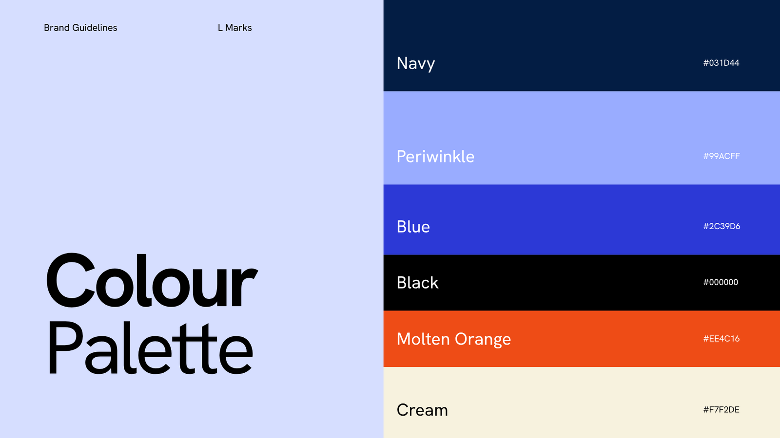
Navy carries trust and experience. It is the primary colour and the corporate side of the work.
Periwinkle is the bridge, moving between corporates and innovators the way the firm does.
Blue carries energy. It is also the most contemporary colour in the palette.
Cream carries clarity, holding the moments that give a reader space to think and imagine, which matters for an audience often arriving with an aspiration rather than a defined problem.
Molten Orange carries care, reflecting a culture of attention to detail followed by action, and acts as a highlight across the identity.
All copy is set in Hanken Grotesk, a contemporary typeface suited to board-paper density.
Co-branding
Almost nothing L Marks publishes appears alone. Programmes carry a corporate partner’s name, government departments and universities appear on the same materials, and cohort companies are credited alongside them, so almost every document carries multiple identities at the same time.
Without an architecture governing that, each programme had been solving it independently, at the cost of consistency. We built a two-tier system that determines which branding leads, following who publishes the document and who it speaks to.
The System in Use
We delivered the system as full guidelines for reference and a working guide, with a master deck of templates to make it easier for the whole team to create on-brand documents.
We built the tone of voice into the tools the team writes with, as a Claude skill they switch on, so the standard applies while the copy is being written.
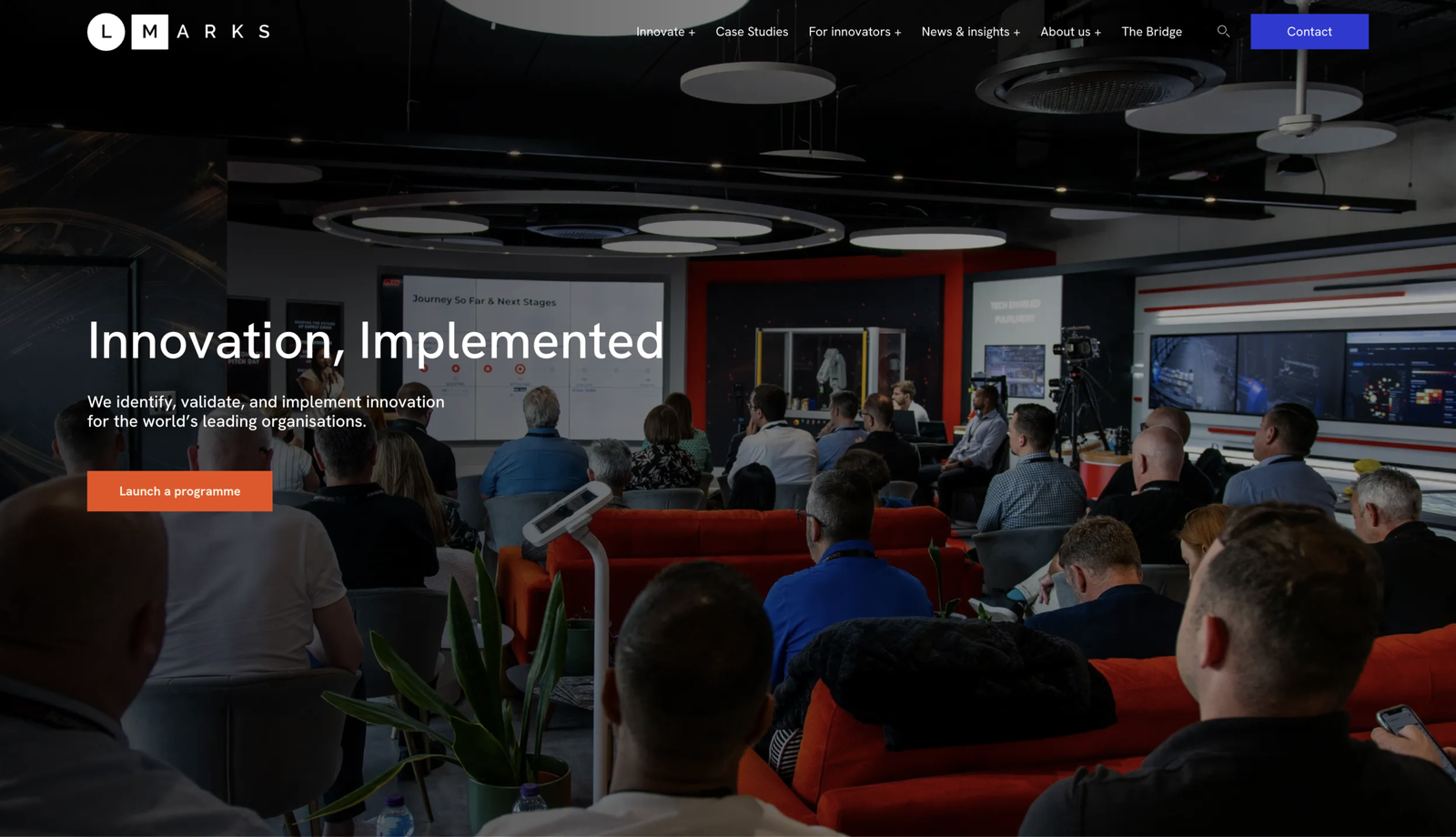
The website was the first place the new identity went live. We brought in photography from the current L Marks programmes, and put the palette and the new font to work across the site.
The Result
A complete verbal and visual identity, consistent across every channel, market and hand that writes under the name.
Built to stand next to a Fortune 500 partner and remain unmistakably L Marks.

Services
Get the latest news
Yes, sign me up for the newsletter.
London
Yes We Can Agency Limited
London, WC2H 9JQ
United Kingdom


©2026 Yes We Can Agency Limited